Banner Printing
San Ramon Banner Printing
Danville Banner Printing
Dublin Banner Printing
Pleasanton Banner Printing
Walnut Creek Banner Printing
Concord Banner Printing
Livermore Banner Printing
Fremont Banner Printing
Binding Services
San Ramon Binding Services
Danville Binding Services
Dublin Binding Services
Pleasanton Binding Services
Walnut Creek Binding Services
Concord Binding Services
Livermore Binding Services
Fremont Binding Services
Brochure Printing
San Ramon Brochure Printing
Danville Brochure Printing
Dublin Brochure Printing
Pleasanton Brochure Printing
Walnut Creek Brochure Printing
Concord Brochure Printing
Livermore Brochure Printing
Fremont Brochure Printing
Business Card Printing
San Ramon Business Card Printing
Danville Business Card Printing
Dublin Business Card Printing
Pleasanton Business Card Printing
Walnut Creek Business Card Printing
Concord Business Card Printing
Livermore Business Card Printing
Fremont Business Card Printing
Commercial Printing
San Ramon Commercial Printing
Danville Commercial Printing
Dublin Commercial Printing
Pleasanton Commercial Printing
Walnut Creek Commercial Printing
Concord Commercial Printing
Livermore Commercial Printing
Fremont Commercial Printing
Digital Printing
San Ramon Digital Printing
Danville Digital Printing
Dublin Digital Printing
Pleasanton Digital Printing
Walnut Creek Digital Printing
Concord Digital Printing
Livermore Digital Printing
Fremont Digital Printing
Flyer Printing
San Ramon Flyer Printing
Danville Flyer Printing
Dublin Flyer Printing
Pleasanton Flyer Printing
Walnut Creek Flyer Printing
Concord Flyer Printing
Livermore Flyer Printing
Fremont Flyer Printing
Large Format Printing
San Ramon Large Format Printing
Danville Large Format Printing
Dublin Large Format Printing
Pleasanton Large Format Printing
Walnut Creek Large Format Printing
Concord Large Format Printing
Livermore Large Format Printing
Fremont Large Format Printing
Other Pages
Home
Terms of Service
Privacy Policy
Blog
Legacy Site
Contact Us
Designing Flyers That Stand Out
Spiral Binding & Booklet Printing Advantages
How Custom Banners Boost Visibility
Seasonal Greeting Card Printing
Ultimate Print Marketing Checklist
Prestige Poster Printing
Prestige Business Card Printing
Prestige Direct Mail Printing
Prestige Commercial Printing
Prestige Banner Printing
Prestige Digital Printing
May 16, 2025
Designing Flyers That Stand Out in San Ramon Neighborhoods for Maximum Local Impact
Designing flyers that catch attention in San Ramon neighborhoods means knowing what the local people want and how they live. You need to create flyers that speak directly to your audience with clear, simple messages and eye-catching visuals.
This helps your flyer stand out from the many others they see every day.
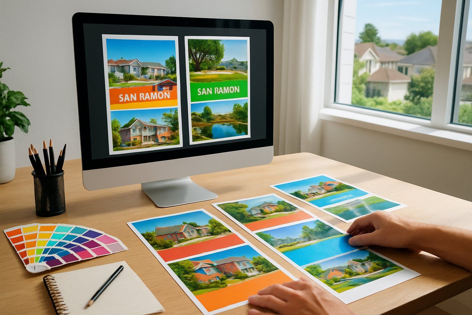
The key is using sharp images, good quality materials, and a design that reflects the local style and values. When your flyer feels familiar and relevant, people are more likely to notice and keep it.
Using smart distribution methods will also make sure your flyers reach the right hands in the community.
Key Takeaways
- Know your audience and design with their interests in mind.
- Use high-quality images and materials to make an impact.
- Make sure your flyers match the local vibe and reach the right people.
Understanding the San Ramon Neighborhoods Audience

To create flyers that catch attention in San Ramon , you need a clear grasp of the people who live there. Knowing who they are, when events happen, and what your competitors do will help you design flyers that fit the area well.
Demographics and Community Preferences
San Ramon has a mix of families, professionals, and retirees. Many residents value quality education and family activities.
Your flyers should reflect this by using clear messages about safety, convenience, and community benefits. The city has a large Asian population, especially Indian and Chinese communities.
Including culturally relevant images and language can make your flyers more relatable. Use simple, direct language and avoid clutter to keep your message clear.
Local neighborhoods tend to appreciate clean, well-organized designs. Avoid overly bright or aggressive colors.
Flyers with a polished, professional look perform better in these areas.
Local Events and Seasonality
San Ramon hosts regular events like farmers markets, outdoor concerts, and seasonal festivals. Timing your flyer distribution around these events increases the chance people will notice and keep them.
For example, flyers promoting summer sales or outdoor services should hit mailboxes before Memorial Day weekend. Fall-focused flyers could align with local harvest festivals or back-to-school seasons.
Think about seasons when choosing images and content. A flyer advertising air conditioning service in summer should use bright, cool colors, while winter flyers might highlight heating options using warmer tones.
Analyzing Competitor Flyers
Look at flyers from local businesses in San Ramon. Note what works well, such as simple layouts, contact info placement, and clear calls to action.
Avoid copying but learn from their strengths. Many successful flyers use bullet points and bold headlines to quickly share key benefits.
They also include landmarks or neighborhood names to create a sense of connection. Pay attention to paper quality and size.
Competitors’ flyers often use standard sizes like 8.5×11 inches with gloss finish to feel professional. Matching or exceeding this quality can help your flyers stand out.
Key Elements of Eye-Catching Flyer Design
To create flyers that grab attention in San Ramon neighborhoods, focus on how color, typography, layout, and calls to action work together. Each part plays a role in making your message easy to read and hard to ignore.
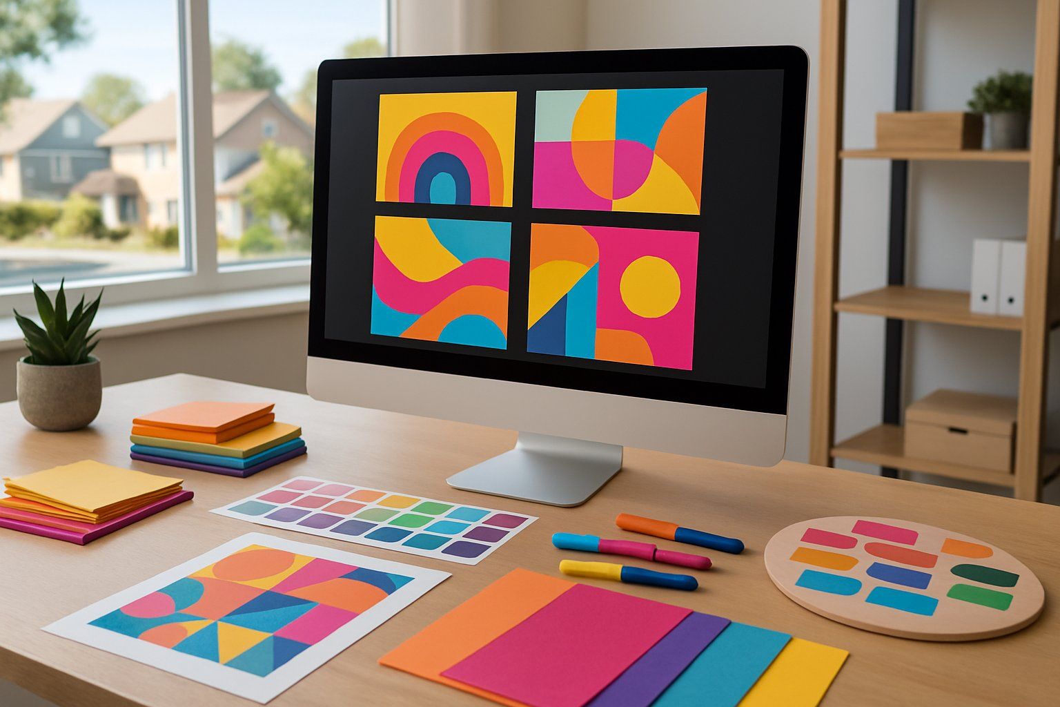
Effective Use of Color and Typography
Choose colors that match your message and stand out on the page. Bright, contrasting colors draw the eye, but avoid using too many.
Stick to two or three main colors to keep your flyer clean and professional. For typography, pick fonts that are easy to read from a distance.
Use bold fonts for headlines and simpler fonts for body text. Avoid fancy or script fonts that can be hard to understand.
Make sure there is enough space between letters and lines to improve readability. Printing services can help you ensure colors come out as expected.
They can also recommend paper types that make colors pop, which also affects how your flyer catches attention.
Strategic Layout and Visual Hierarchy
Arrange your flyer in a clear order that guides readers through the information. Place the most important points at the top or in a larger size.
Use headings, bullet points, and images to break up text and make scanning easier. Visual hierarchy means making your headline the biggest text, with supporting details getting smaller.
This helps people quickly understand what your flyer is about. Keep margins and spacing even to avoid clutter.
Working with printing services , you can review proofs to check how your layout looks on paper. This step ensures no details get lost or hard to read after printing.
Highlighting Calls to Action
Your flyer needs a clear call to action (CTA). This tells readers what to do next, like calling a phone number, visiting a website, or attending an event.
Use action words like “Call now,” “Visit today,” or “Join us.” Make the CTA stand out by using bold text or a different color box.
Place it near the bottom or center, where the reader’s eyes naturally rest. Including contact info in a larger font or bold style helps readers act quickly.
Printing services can suggest ways to make CTAs pop using spot UV or raised ink options for added emphasis.
Optimizing Resolution and Print Quality
To create flyers that look sharp and professional, you need to focus on image resolution and file setup.
Using the right resolution and preparing your files properly will help your flyers print clearly and avoid blurriness or pixelation.
Choosing the Right Image Resolution
When selecting images for your flyers, resolution matters most . You should use images with at least 300 dots per inch (DPI) .
This is the standard for most printing services and ensures your images won’t appear blurry or grainy when printed. Avoid using images from the web that are usually 72 DPI.
These will not hold up well in print and can lead to poor-quality flyers. If you need to resize an image, try to keep the original resolution high.
Enlarging low-resolution images often reduces quality.
Best Practices for Print-Ready Files
To get the best print quality, export your flyer files in formats like PDF, TIFF, or JPEG with high resolution. Make sure to include a bleed area of about 0.125 inches around the flyer edges.
This prevents white borders from showing after trimming. Use CMYK color mode instead of RGB because printers use CMYK.
This helps your flyer colors look accurate and consistent. Always check for any fonts that aren’t embedded or linked properly, as missing fonts can alter your flyer’s appearance when printed.
Material Choices for Memorable Flyers
Choosing the right material affects how your message looks and feels. The finish of your flyer can change how colors appear, while paper weight influences its durability.
Texture also plays a role in grabbing attention and making your flyer feel unique.
Exploring Matte and Glossy Finishes
Matte finishes reduce glare and give your flyer a smooth, non-shiny look. This makes your flyer easier to read under bright light.
Matte is good if you want a classic, subtle feel and your colors will appear softer. Glossy finishes reflect light and make colors brighter and sharper.
They draw the eye more quickly and can make images stand out better. However, shiny gloss can create unwanted reflections, making text harder to read in some lighting.
If you want your flyer to look elegant and easy to handle, stick with matte. For vibrant, bold flyers with eye-catching photos, glossy works better.
Comparing Paper Weights and Textures
Paper weight is measured in pounds (lb) or grams per square meter (gsm). Heavier paper feels sturdier and lasts longer in San Ramon neighborhoods where flyers might be handled a lot.
Lighter paper is cheaper but can crease or tear easily. Common flyer paper weights are:
- 80 lb or 120 gsm: Thin and affordable for large runs
- 100-110 lb or 150-200 gsm: Medium weight, good balance of durability and cost
- Over 130 lb or 250 gsm: Thick, feels premium and more durable
Texture changes how your flyer feels in hand. Smooth paper provides a clean look, while textured options like linen or felt add a tactile element.
Textured matte flyers feel more unique but may raise printing costs. Choose the right paper weight and texture to fit your budget, design style, and how long the flyer needs to last.
Incorporating Local Identity and Branding
To make your flyers or business cards effective in San Ramon, use design elements that match the area’s style and values. Focus on local themes and colors that help your materials feel connected to the community.
Customizing Designs for San Ramon
San Ramon has a mix of modern suburbs and natural beauty. Use clean lines and calm colors like blues and greens on your flyers to reflect this.
You can also add simple graphics showing local landmarks, such as the city’s parks or the Dougherty Hills. Make sure your business cards and flyers use fonts that are easy to read but also feel friendly.
Avoid styles that are too flashy or formal. Consider including local dates or events when they matter for your offer.
This shows you understand and respect the community’s calendar.
Reflecting Neighborhood Character
Each San Ramon neighborhood has its own vibe. For example, Tassajara is family-focused with many parks, so warm colors and clear, friendly text work well there.
In contrast, Crow Canyon residents might respond better to sleek and professional designs for business flyers. Use photos or illustrations that show real local life.
Be careful that your branding fits the trust people place in community businesses. Your flyer or business card should feel like a natural part of the neighborhood, not an outside ad.
This builds better connections and higher chances of engagement.
Promotional Pairings and Multi-Channel Strategies
Using different marketing items together can boost your message and help you reach more people in San Ramon neighborhoods. Combining flyers with other materials or channels makes your campaign stronger and more memorable.
Coordinating Flyers with Business Cards
You want your flyers and business cards to share the same look. Use matching colors, fonts, and logos on both items.
This helps people quickly connect your flyer to your business card when they see them together. On your flyer, include a clear call to action that points people to take your card or contact you.
Business cards are easy to carry, so people can keep your info after they read your flyer. Make sure your business card includes essential details like your phone number, website, and social media.
These details encourage follow-up after the flyer has been read.
Integrating Flyers with Shirts and Other Merchandise
Adding flyers to merchandise like shirts creates a strong brand presence. When you give away shirts with your logo, people become walking advertisements in the neighborhood.
Include your flyer with each shirt order or at events. This way, people get your message in two ways—wearable and readable.
Keep designs consistent across all materials. Use the same logo placement and colors on your shirt and flyer to build trust and recognition.
Merchandise can also include coupons or special codes printed on the flyer to encourage immediate action.
Printing Services in San Ramon
Choosing the right printer and print method affects the quality and cost of your flyers. Knowing the benefits of local suppliers and print options can help you make the best choice for your flyer needs.
Selecting a Local Printing Partner
Working with a local printing service in San Ramon gives you easier communication and faster turnaround times. Local printers often understand the community better and can offer advice on what works for your neighborhood.
Look for printers that specialize in flyers and ask for samples to check print quality. You should also inquire about their paper options, color accuracy, and finishing services.
Choosing a local partner means you can often visit their shop to discuss your project in person. Local businesses may offer better pricing without extra shipping fees.
Comparing Digital and Traditional Print Methods
Digital printing is faster and ideal for small runs or flyers needing frequent updates. It uses toner or inkjet technology and can produce sharp colors but may cost more per flyer for large quantities.
Traditional or offset printing is better for big orders. It offers consistent color and detail at a lower price per flyer when you print in bulk.
However, it has longer setup times and less flexibility for last-minute changes.
Key differences:
| Feature | Digital Printing | Traditional (Offset) Printing |
|---|---|---|
| Best for | Small batches, quick jobs | Large orders |
| Cost per flyer | Higher for large runs | Lower for large runs |
| Print quality | Good, vibrant colors | High precision and color accuracy |
| Setup time | Minimal | Longer |
Flyer Distribution and Storage Solutions
To keep your flyers in good shape and get them into the right hands, you need a plan for storing and sharing them. Proper storage prevents damage, while smart distribution helps you reach the right San Ramon neighborhoods on time.
Efficient Storage and Handling
You should store your flyers in a cool, dry place to avoid warping or fading. Use flat boxes or binders to keep them from bending or folding.
Label each batch clearly, so you can find specific flyers quickly. Handle your flyers with clean hands or gloves to keep them neat.
Avoid stacking heavy items on top of the flyers to prevent creases or tears. For larger runs, consider using plastic sleeves or folders.
These protect your flyers while keeping them visible and ready for fast distribution.
Optimal Distribution Channels
Choose distribution spots carefully to reach your target neighborhoods. Door-to-door delivery is effective for residential areas but requires permission in some places.
You can also distribute flyers at local businesses, community centers, or events in San Ramon. Ask business owners if you can leave stacks near the entrance.
Using a schedule helps you cover all areas evenly. Track where and when you distribute to avoid wasting flyers in less active zones.
Consider hiring local flyer distributors familiar with the neighborhoods. They understand the best times and places for handing out flyers.
Tracking Results and Improving Flyer Campaigns
Tracking how well your flyers perform helps you see what works and what doesn’t. Using clear numbers and feedback lets you make better choices for future campaigns.
Measuring Engagement and ROI
To measure engagement, track responses such as calls, website visits, or coupon redemptions linked to your flyer. Use unique codes or URLs printed on each flyer to identify which neighborhood or design gets the best reaction.
Calculate Return on Investment (ROI) by comparing the money spent on printing and distribution with the revenue that results from the flyer campaign. For example, if you spend $200 on flyers and generate $600 in sales, your ROI is 200%.
You can also ask recipients for feedback through quick surveys or social media posts connected to the flyer. This helps confirm if people noticed the flyer and what message stood out most.
Iterative Improvements for Better Performance
After gathering data, make clear changes to your flyer design or distribution strategy. If certain neighborhoods respond better, focus your next batch there.
If a design element gets low attention, try adjusting colors, fonts, or headlines. Test small changes before a large run.
For instance, print a few flyers with a different call to action or image and compare their results in the same area. This helps you find stronger versions and avoid wasting money.
Keep notes on what you change and the results. Over time, this record reveals trends and helps you create flyers that get better results with each campaign.
Frequently Asked Questions
Choosing colors that match the neighborhood vibe can help your flyer get noticed. Including clear, simple text and strong visuals makes people stop and read.
You want to use the right printing and wording to connect with the people in San Ramon.
What are the best color schemes for neighborhood flyers in San Ramon?
Use colors that reflect the area’s natural and community feel. Earth tones like green, brown, and beige work well.
Bright colors like blue or orange can attract attention without being too loud.
How can I ensure my flyer design is effective for local audience engagement?
Keep your message clear and direct. Use easy-to-read fonts and include a call to action.
Add images or icons that local residents recognize.
What are the most important elements to include on a flyer for community events?
Include the event name, date, time, and location. Add contact details and a brief description.
Use visuals related to the event’s purpose.
Which printing techniques can make my flyer more noticeable in San Ramon?
Glossy finishes catch the eye. Raised ink or spot UV coating adds texture.
Use thicker paper to give a quality feel.
How can I tailor the message of my flyer for different San Ramon demographics?
Adjust your tone and language based on age and interests. Use simple words for families and local slang if it fits the group.
Highlight benefits that matter most to each segment.
What are the legal considerations to keep in mind when distributing flyers in San Ramon?
Check San Ramon’s rules on where you can distribute flyers. Avoid posting on private property without permission.
Respect local noise and littering laws.…
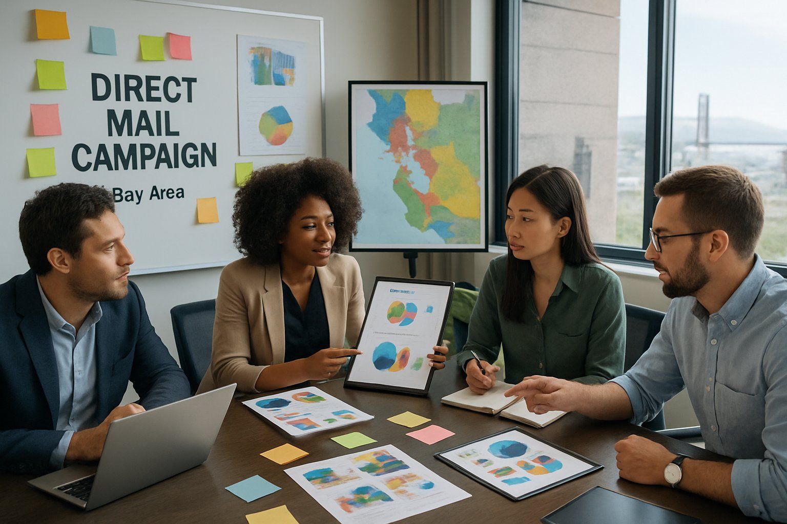
Creating direct mail that truly connects with Bay Area audiences means understanding their unique preferences and needs. Effective campaigns use precise targeting combined with personalized messaging that speaks directly to recipients’ interests.
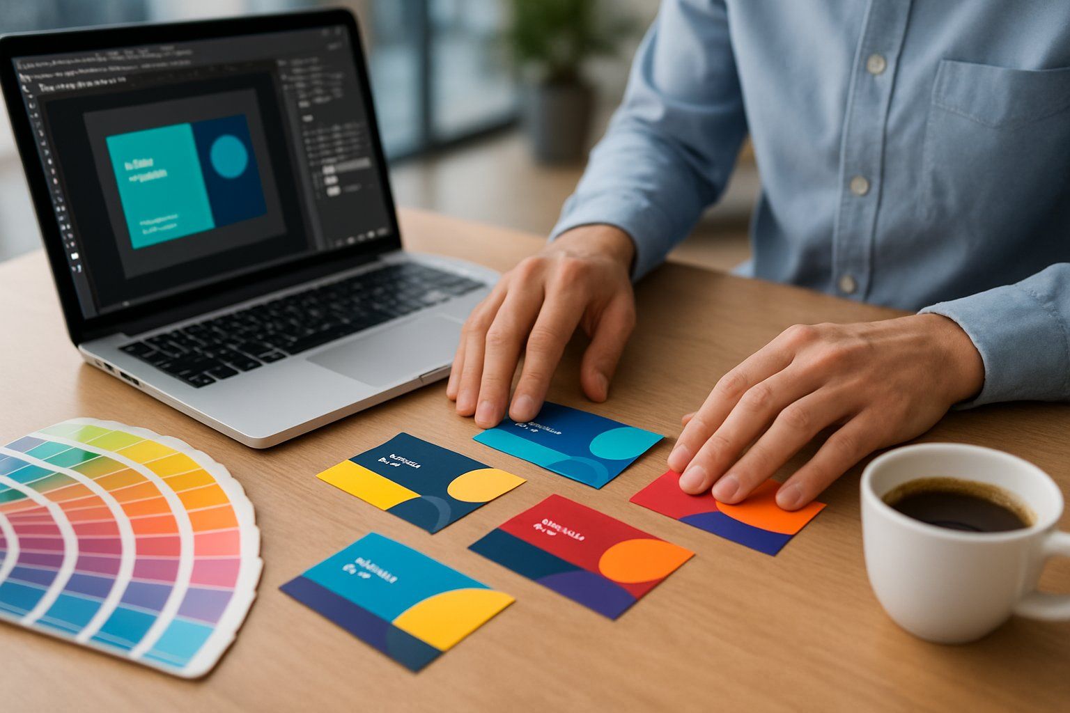
For companies in San Ramon, a business card is often the first chance to create a strong impression.
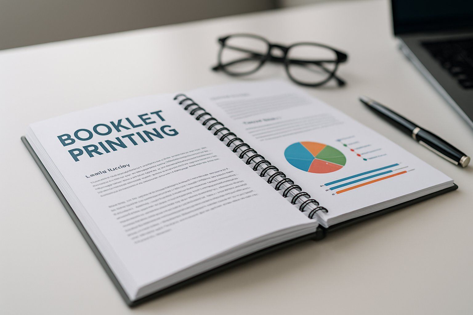
If you need a simple and effective way to organize documents in San Ramon , spiral binding and booklet printing are great options. Spiral binding lets you flip pages easily while keeping your materials secure and neat.
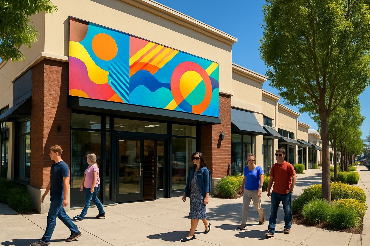
Custom banners can make a big difference for your San Ramon storefront by attracting more attention from people passing by.
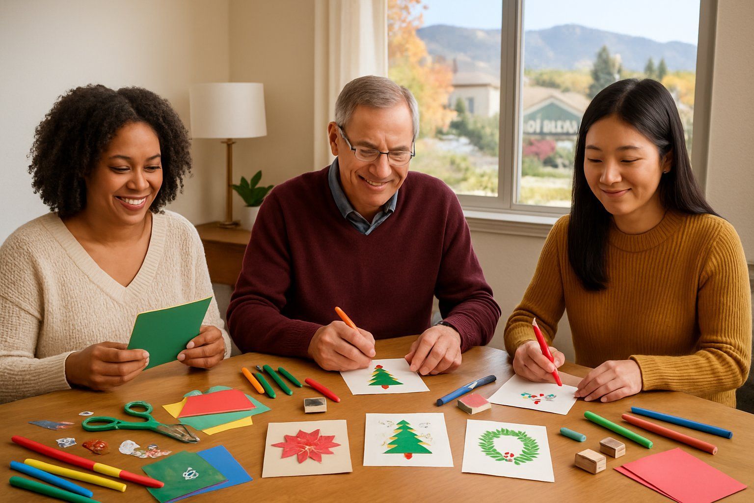
Seasonal greeting card printing in San Ramon makes it easy for you to share warm wishes with friends, family, and neighbors. You can find local services that offer quality cards tailored to the seasons and holidays you care about most.
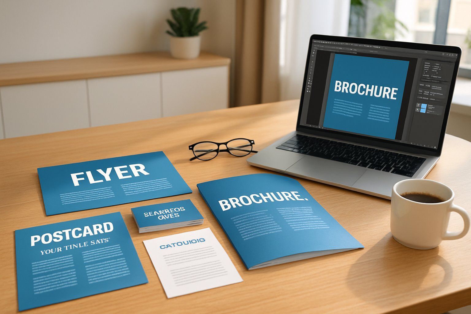
If you’re planning to use print marketing in San Ramon, having a clear checklist can save you time and money.
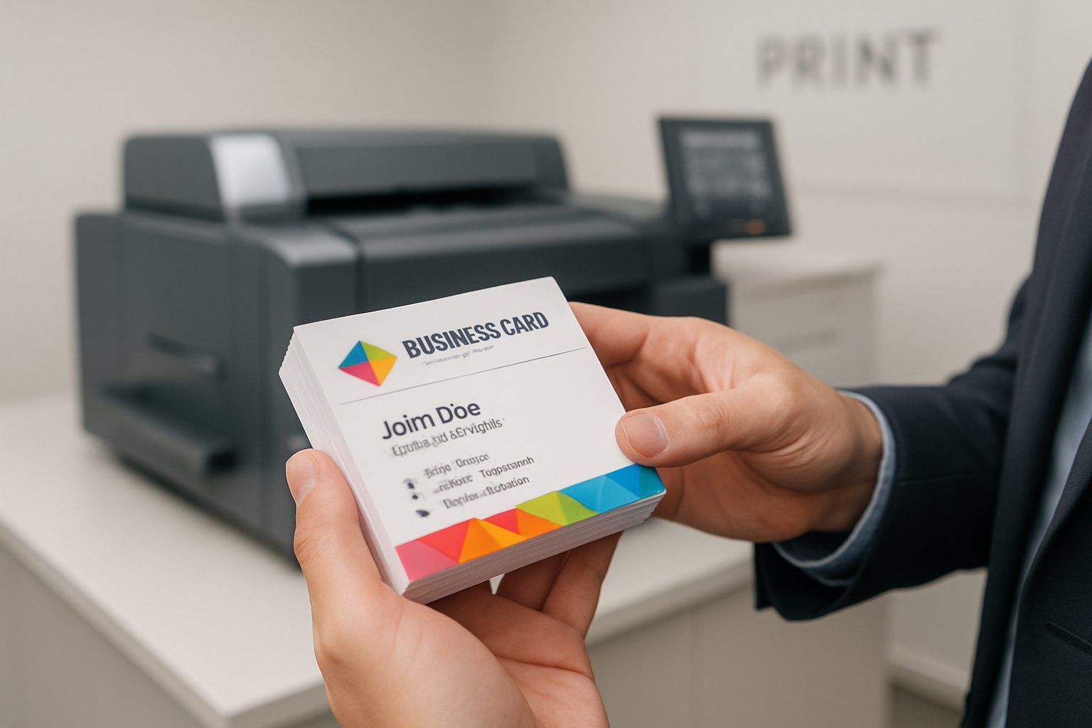
At Prestige Printing & Graphics in San Ramon, we offer high-quality business card printing that helps you make a strong first impression.

When you need high-quality poster printing in San Ramon, Prestige Printing & Graphics is the right choice. We offer clear, sharp prints that make your message stand out, whether for business, education, or events.
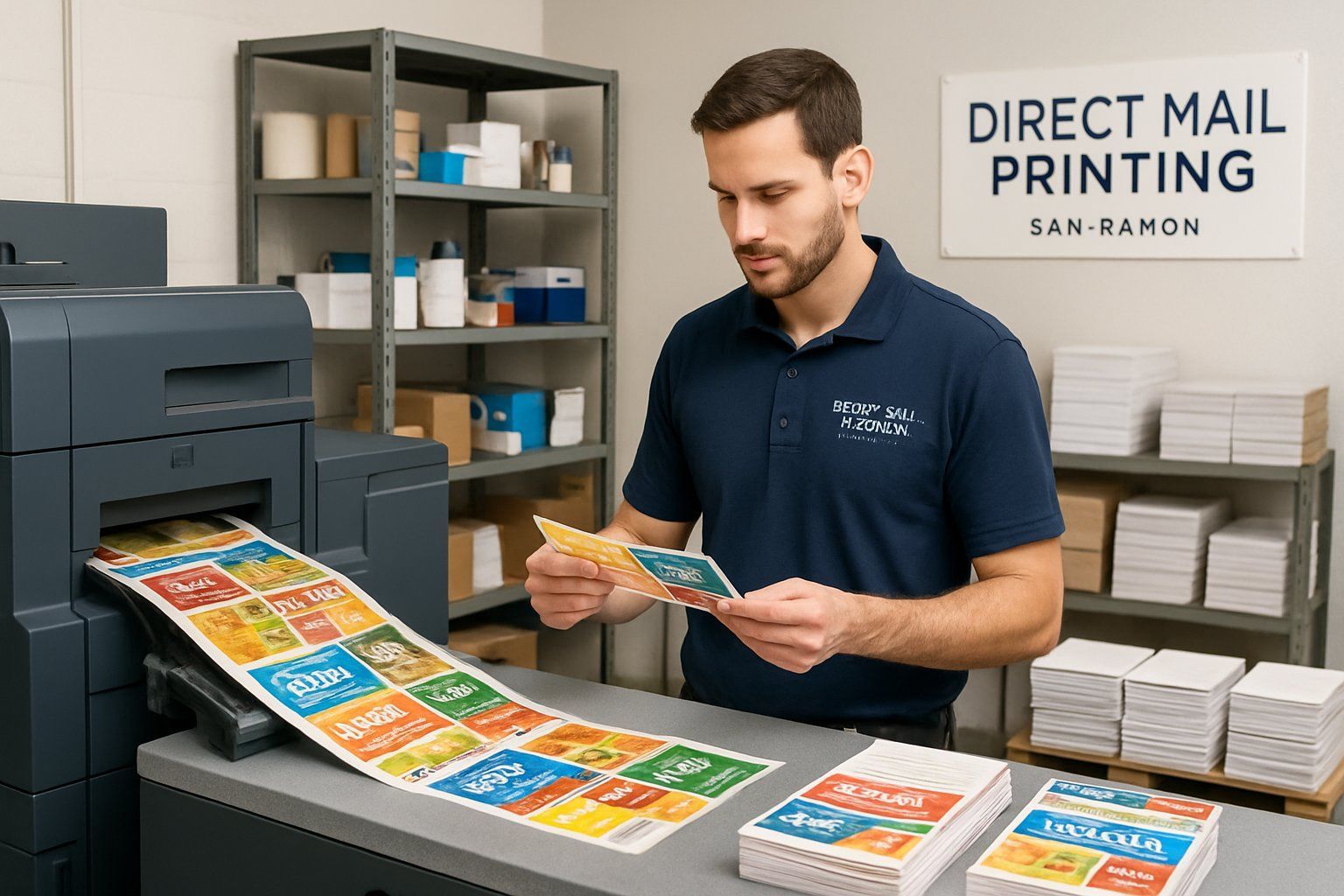
Looking for reliable direct mail printing in San Ramon? At Prestige Printing & Graphics, we provide high-quality direct mail services that help your business reach the right audience.
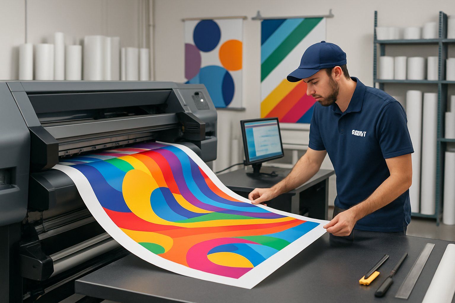
When it comes to banner printing, Prestige Printing & Graphics offers reliable, high-quality services that meet a wide range of needs. Whether for events, promotions, or business branding, their banners are made to stand out.